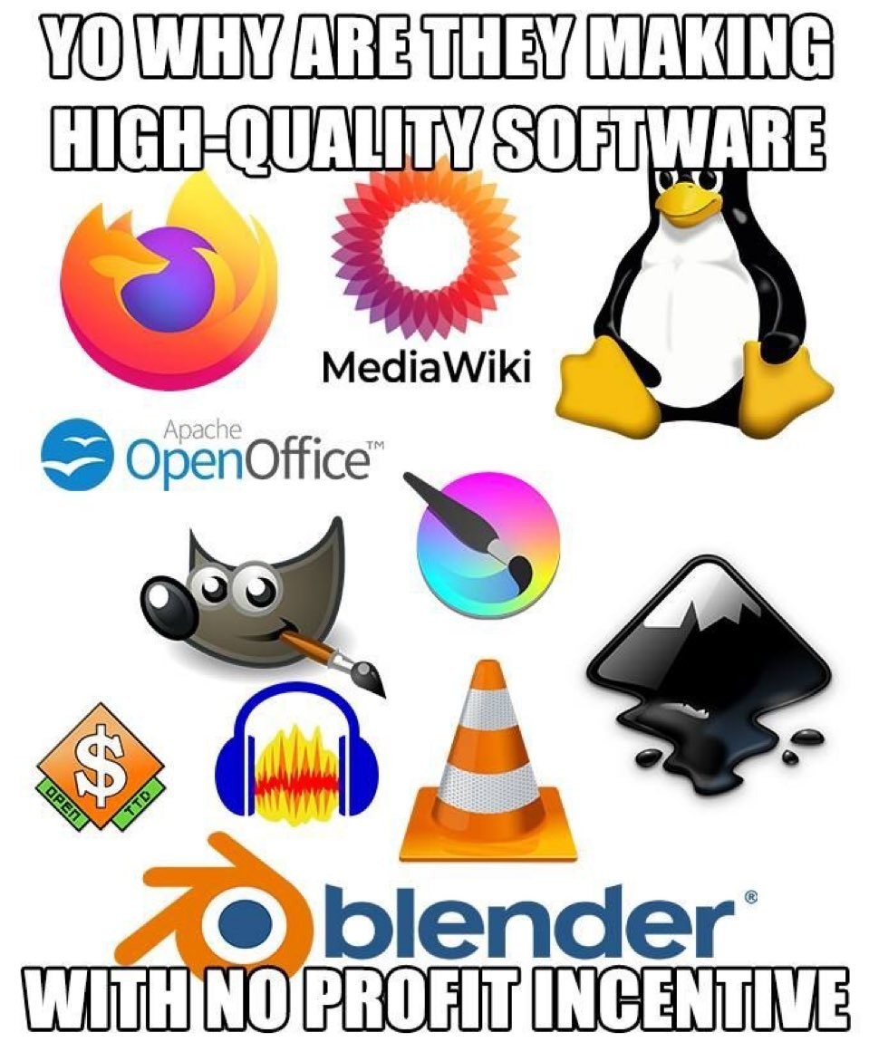
Lmao I’ve been doing a digital forensics class online, and it’s always got VMs with ancient versions of software on it, so I got to discover what Apache OpenOffice was. Love that they have to use FOSS to teach us shit since Windows needs a subscription.
Typo
I almost wrote dogital forensics. Is that using dogs to find data? Sniff out that hard drive and get datadumping boy!
OpenOffice was dead before it was transferred to Apache, so it’s not old enough to excuse.
That Firefox logo is from 2019. Oracle killed OpenOffice in 2011. Like, they actually completely stopped all work on it. They intentionally killed it at least eight years before this image was made.
To expand further on your point, here are the releases for Apache Open Office (OO). We are at 4.1.6. the page for 4.1 release was last updated in 2014. It’s been mainly small bug fixes since then.
LibreOffice (LO) and Open Office were essentially the same application at OO 4.0 vs LO 4.1. LO had 3 major releases by 2023 before it went from 7 to 24. With the annual releases it is me difficult to gauge progress in the same way. But we are already at 26.2.
LibreOffice’s look stems in large part from the UI toolkit that they use. Which was guaranteed to look like Windows, since LO is made in Java, and is not gonna be changed easily.
Is there an office suite you had in mind that looks futuristic? Comparing a slightly old version of LibreOffice with a modern version of MS Office… They look pretty similar to me? (The gray document background in libreoffice is from me, it defaults to something closer to MS office).
I haven’t used Apple’s suite much, but it’s likely that LO could learn something from it, for the simple reason that Apple knows about the principles of grouping in design and thus never subscribed to the approach of ‘cram lots of buttons in the toolbars without spacing’.
However, changing the paradigm of the existing UI is probably a big ask.
Ah, I assumed you were comparing it to MS Office as the gold standard, and chose the tabbed mode to make it closest to that, though I don’t personally use it that way myself.
LibreOffice has a simpler mode, though not quite as bare-bones as your Apple example. It’s how I how use it personally:
There’s also a Sidebar mode, which can collapse out of the way when not in use, or be brought back by pressing a small button on the side of the program.
I agree it could stand to offer a mode with much more spacing and just the essential options, but I think for the most part, the simpler toolbar mode which I use is pretty adequate, and doesn’t feel overwhelming to use.
Alternatively, Libreoffice is quite customizable, so a user can remove every option from the toolbar they never use, and make it appear nicer and less cramped.
I’m not the guy to whom you originally replied, so I’m just chiming in with my observations. I would never pose MS’ design as anything to aspire to, because MS only recently learned about the principles of grouping, which is very basic design stuff. Their design philosophy for ages consisted of crammed toolbars, crammed lists, and crammed tables.
Unfortunately, LibreOffice isn’t better in this regard, and won’t be until they work on the UI toolkit to allow a different approach (like e.g. Firefox does allow). Apple’s UI is good not because it’s ‘bare-bones’, but because it organises elements visually instead of piling them all into a giant toolbar for the user to wade through. Other Mac apps are the same way, usually including third-party ones because they follow Apple’s guidelines. Btw, iirc the toolbars are typically customizable.
until they work on the UI toolkit to allow a different approach (like e.g. Firefox does allow)
Like how Firefox lets you drag and drop icons and spacers around? That would be cool to have in Libreoffice.
Apple’s UI is good not because it’s ‘bare-bones’, but because it organises elements visually instead of piling them all into a giant toolbar for the user to wade through.
Could definitely see that as a big improvement, even as someone quite used to the Windows 95 way of doing things (or at least, I prefer the old way to the ribbon), hopefully someone who has a similar itch to us as well as the capabilities to implement it does so someday :)
Like how Firefox lets you drag and drop icons and spacers around?
Yeah, the spacers are the key thing here, because humans perceive spaced-out things to be topically distinct. Meanwhile Windows always offered separator bars to divide groups of buttons in the toolbars, which of course added visual noise. Idk what toolkit LO uses, but from what I’ve seen Java UIs typically follow Windows’ conventions.


Apache OpenOffice??
Surely you meant LibreOffice. OpenOffice has basically been dead for years, with no significant work going on.
Lmao I’ve been doing a digital forensics class online, and it’s always got VMs with ancient versions of software on it, so I got to discover what Apache OpenOffice was. Love that they have to use FOSS to teach us shit since Windows needs a subscription.
Typo
I almost wrote dogital forensics. Is that using dogs to find data? Sniff out that hard drive and get datadumping boy!
remember to scoop the poop after
It’s an older image, not updated.
OpenOffice was dead before it was transferred to Apache, so it’s not old enough to excuse.
That Firefox logo is from 2019. Oracle killed OpenOffice in 2011. Like, they actually completely stopped all work on it. They intentionally killed it at least eight years before this image was made.
I agree that it shouldn’t be there. LibreOffice is the clear replacement.
LibreOffice just doesn’t roll of the tongue like OoenOffice though. Which really sucks. I even catch myself saying it when I mean LibreOffice.
To expand further on your point, here are the releases for Apache Open Office (OO). We are at 4.1.6. the page for 4.1 release was last updated in 2014. It’s been mainly small bug fixes since then.
https://www.openoffice.org/development/releases/
LibreOffice (LO) and Open Office were essentially the same application at OO 4.0 vs LO 4.1. LO had 3 major releases by 2023 before it went from 7 to 24. With the annual releases it is me difficult to gauge progress in the same way. But we are already at 26.2.
https://www.libreoffice.org/about-us/libreoffice-timeline/
All of the ones here are pretty old, so I can believe the meme is over 10 years old with mayve the firefox logo swapped out
LibreOffice has been updated? Interface still looks like it was designed for Windows 95.
deleted by creator
LibreOffice’s look stems in large part from the UI toolkit that they use. Which was guaranteed to look like Windows, since LO is made in Java, and is not gonna be changed easily.
Is there an office suite you had in mind that looks futuristic? Comparing a slightly old version of LibreOffice with a modern version of MS Office… They look pretty similar to me? (The gray document background in libreoffice is from me, it defaults to something closer to MS office).
Also @[email protected]
I haven’t used Apple’s suite much, but it’s likely that LO could learn something from it, for the simple reason that Apple knows about the principles of grouping in design and thus never subscribed to the approach of ‘cram lots of buttons in the toolbars without spacing’.
However, changing the paradigm of the existing UI is probably a big ask.
Ah, I assumed you were comparing it to MS Office as the gold standard, and chose the tabbed mode to make it closest to that, though I don’t personally use it that way myself.
LibreOffice has a simpler mode, though not quite as bare-bones as your Apple example. It’s how I how use it personally:
There’s also a Sidebar mode, which can collapse out of the way when not in use, or be brought back by pressing a small button on the side of the program.
I agree it could stand to offer a mode with much more spacing and just the essential options, but I think for the most part, the simpler toolbar mode which I use is pretty adequate, and doesn’t feel overwhelming to use.
Alternatively, Libreoffice is quite customizable, so a user can remove every option from the toolbar they never use, and make it appear nicer and less cramped.
I’m not the guy to whom you originally replied, so I’m just chiming in with my observations. I would never pose MS’ design as anything to aspire to, because MS only recently learned about the principles of grouping, which is very basic design stuff. Their design philosophy for ages consisted of crammed toolbars, crammed lists, and crammed tables.
Unfortunately, LibreOffice isn’t better in this regard, and won’t be until they work on the UI toolkit to allow a different approach (like e.g. Firefox does allow). Apple’s UI is good not because it’s ‘bare-bones’, but because it organises elements visually instead of piling them all into a giant toolbar for the user to wade through. Other Mac apps are the same way, usually including third-party ones because they follow Apple’s guidelines. Btw, iirc the toolbars are typically customizable.
Ah, so you are! My mistake :p
Like how Firefox lets you drag and drop icons and spacers around? That would be cool to have in Libreoffice.
Could definitely see that as a big improvement, even as someone quite used to the Windows 95 way of doing things (or at least, I prefer the old way to the ribbon), hopefully someone who has a similar itch to us as well as the capabilities to implement it does so someday :)
Yeah, the spacers are the key thing here, because humans perceive spaced-out things to be topically distinct. Meanwhile Windows always offered separator bars to divide groups of buttons in the toolbars, which of course added visual noise. Idk what toolkit LO uses, but from what I’ve seen Java UIs typically follow Windows’ conventions.
It still looks and behaves like StarOffice.
The templates they include look ancient as well. They do have a mediocre copy of Microsoft’s ribbon interface.